

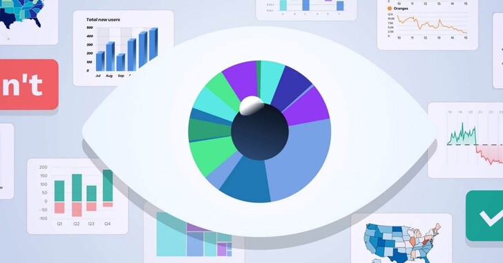
Today's application design and development are increasingly data-driven, so there is an increasing demand for high-quality data visualization. However, we found that many charts are not easy to understand and even misleading in practice, so this article lists the following 20 optimization suggestions, hoping to help you achieve better data visualization.
1. Choose the correct chart type
Choosing the wrong chart type, or simply defaulting to the most common chart type, can confuse users or misinterpret the meaning of the data. A dataset can be represented in many ways, depending on the user's needs. So be sure to start by examining the dataset and researching user needs to choose a chart type.

2. Determine the correct drawing direction based on the positive and negative values of the data
When using a horizontal bar chart, be careful to draw negative values to the left of the baseline and positive values to the right.
Do not draw negative and positive values on the same side of the baseline.

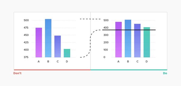
3. The starting point of the histogram should start from the 0 baseline
Truncating data can lead to incorrect representations. In the example below, looking at the graph on the left, you can quickly conclude that the B value is more than 3 times the D value. In reality, however, the gap is much smaller (see chart to the right).
So, plotting from a zero baseline ensures a more accurate representation of the data.
4. Line charts can use an adaptive Y-axis scale
For a line chart, if you always limit the display starting point of the Y-axis to 0, it may make the chart's line display lack fluctuation and almost flat. Since line graphs are primarily used to represent trends, it is best to be able to adjust the display scale based on the data set at a particular stage and keep the line graph displayed within two-thirds of the Y-axis range.

5. Consider the time series of the data when using line charts
Line charts are made up of a series of "markers" connected by lines and are often used to visualize trends in data over a time interval (a specific time series). This helps illustrate how values change over time, works great for short time intervals, but can be confusing when data is updated infrequently.
For example, The above graph uses a line graph to represent annual income. If the value is updated monthly, then you need to view the graph by month. A user may think that each point on the line connecting the "marks" represents a revenue value at that time, when in fact the true revenue number at that particular time is unknown.
In this case, using a vertical bar chart might be a better option.
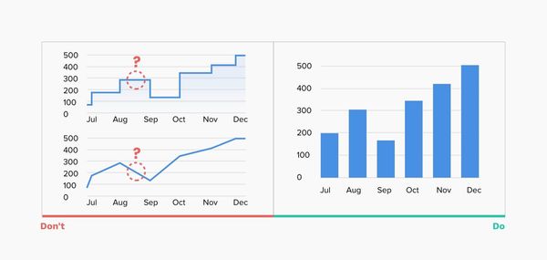
6. Don’t use “smooth” line charts
Smooth line charts may be visually pleasing, but they distort the actual data behind them, and overly thick lines obscure where the real "markers" are.

7. Avoid confusing two-axis charts
Sometimes to save chart space, you may prefer to use a two-axis chart, where two data series have the same measure, but vary by different amounts. Such charts are not only difficult to read but also do not clearly represent the contrast between the two data series. Most users don't pay attention to the display scale, and they are likely to just glance at the graph and come to the wrong conclusion.

8. Limit the number of blocks displayed in the pie chart
Pie charts are one of the most popular charts, but they are also often abused. In most cases, a bar chart is a better choice. However, if you decide to use a pie chart, here are some tips on how to get it right:
- Display no more than 5-7 blocks, keeping the overall visual simple and clear.
- You can group the extra smallest blocks into "other" blocks.

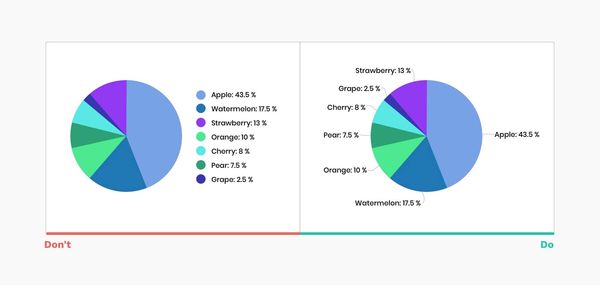
9. Label directly on the chart
No matter how good your chart is, it won't make sense without proper labels. Labeling directly on the chart helps a lot for all viewers. The comparison of the legend requires one-to-one correspondence between the values and the corresponding areas, which will consume more time and energy for the viewer.
10. Don't put labels directly in the chart blocks
Putting value labels directly in blocks may reduce the readability of the chart, and if there are very small blocks, it is not easy to display them completely. The correct way is to add a black numerical label outside the block to mark a clear link with each block.
11. Sort pie chart blocks by size to improve readability
There are several common ways to use pie charts:
- Place the largest block at the 12 o'clock position and place the remaining blocks in descending clockwise order.
- Put the largest block at 12 o'clock, the second largest block at the back clockwise, the third-largest block at 11 o'clock, and the rest of the blocks in clockwise order by size.

12. Avoid randomness
The same advice applies to many other types of charts, don't preset alphabetical ordering. Put the largest values on the top (for horizontal bars) or far left (for vertical bars) to ensure the most important values occupy the most prominent space, reducing eye movement and the time it takes to read the graph.
The horizontal bars on the left are in random order, and the right is sorted from maximum to minimum.

13. Thin circle charts are unreadable
In general, pie charts are not the most readable charts because it is difficult to visually compare similar values. But when we remove the middle and get a doughnut-shaped graph, that does free up space for additional information, but at the expense of clarity, so taking it too far can make the graph useless.

14. Let the data speak for itself
Avoid too many unnecessary flashes, as it is not only distracting but can lead to misinterpretation and misperception of data. The following should be avoided when making charts:
-Use 3D elements
-Use shadows, gradients, and other color transformations
-Using Zebra Patterns and Excessive Gridlines
-Use overly decorative, italic, bold, or serif fonts

15. Choose a color scheme that matches the nature of your data
Color is an important part of data visualization, and there are usually three types of color schemes:
- Qualitative Color Scheme: Best for categorical display variables. The colors chosen should be unique to ensure differentiation.
- Sequential color scheme: Best for numeric variables that need to be in a specific order. Using hue or lightness or a combination of both, you can create a continuous set of colors.
- Divergent color scheme: is a combination of two consecutive color palettes with a central value (usually 0) in between. Usually, divergent palettes are used to describe changes in the positive and negative values of the data. The colors used also need to conform to the concepts of "negative" and "positive".
There is a handy tool - ColorBrewer, which can help you generate various color schemes.

16. Accessible Design
About one in 12 people is colorblind, according to the National Eye Institute. Your chart needs to be readable by the widest possible audience, so be careful to make it as accessible as possible.
- Different saturation and lightness are used in the color scheme.
- Print your data visualization in black and white to check its contrast and readability.

17. Focus on readability
Make sure the typography conveys the message accurately and clearly, helping users focus on the data rather than distracting them.
- Choose readable fonts and avoid serifs and highly decorative fonts
- Avoid italics, bold and capital letters
- Make sure the text color is highly contrasted with the background-color
- Do not rotate text

18. Use horizontal bars instead of rotated labels
This simple trick will ensure users can view the chart more easily (without straining their necks).

19. Choose the right charting library
If your task is to add interactive diagrams to web and mobile projects, the first question you should ask is what diagramming library will we be using? Modern charting libraries already apply many of the aforementioned rules. Designing based on a defined library ensures ease of implementation and gives you plenty of interactive ideas.

20. Dynamic Visualization Reports
Data visualization is not just a static chart, we have many ways to help users explore and discover more conclusions by changing parameters, visualization types, and timelines to maximize data value and insight. In the example below, you can see the iOS Health app, which uses a combination of various data presentations for a nice presentation.

0 Comments